
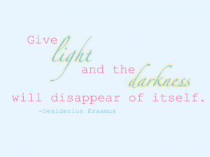
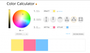
I chose this quote because I thought I could add neat effects under “light” and “darkness.” I did that by adding the outer glow of yellow, the base color of my color scheme. I knew I wanted to work with yellow for this quote because it’s the general color of light. I used pinks and blues, but the blue turned into a green shade against the yellow, that is one thing I would have changed if it weren’t for the time situation.
Dear Maya,
I love your color scheme!!! I think that the colors go really well with the quote and I think you did a great job!
this font is very cool